
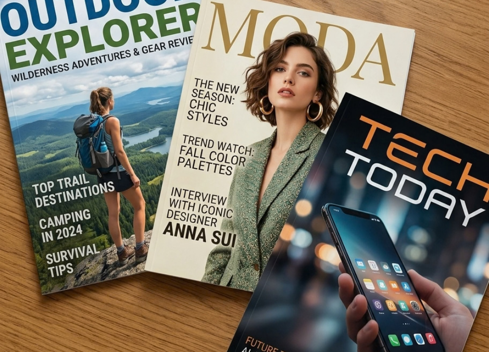

A magazine cover is often the first thing a reader notices. Before someone opens an issue, the cover has already communicated something about its subject, personality, quality, and audience. Good magazine covers do more than decorate a publication. They create curiosity, establish a visual identity, and help readers understand what they can expect inside.
For beginners, cover design can seem complicated because photography, typography, color, spacing, branding, and editorial messaging all have to work together. The good news is that effective design is not simply about having advanced software skills. It starts with understanding a few practical principles and applying them consistently.
What Are Magazine Covers?
A magazine cover is the front-facing design that introduces a particular issue of a publication. It normally contains the publication name, a main visual, headlines or cover lines, issue information, and sometimes details such as a price or barcode. A cover serves several purposes at once. It identifies the publication, highlights important editorial content, attracts attention, and gives the audience a quick sense of the issue’s theme. In print, it also needs to meet production requirements. For digital publishing, it must remain recognizable and readable on screens of different sizes.
Why Do Magazine Covers Matter?
The cover has a powerful communication role because readers often make quick judgments based on what they see. A clear and relevant design can make a publication easier to recognize and its main story easier to understand. Strong magazine covers can also build consistency from one issue to another. When a publication uses recognizable typography, colors, imagery, and masthead treatment, readers can identify its brand more easily.
Key Elements of Effective Magazine Covers
Cover Image and Visuals
The main image usually provides the visual starting point. It might be a photograph, illustration, collage, graphic composition, or another form of artwork. Choose an image that relates directly to the issue or its leading story. Quality matters, but relevance matters just as much. A technically beautiful image can still be a poor choice if it does not support the editorial message.
Magazine Title and Masthead
The masthead is the publication’s name or primary identifying mark. It is one of the most important branding elements on the page. Its position and treatment should feel intentional and consistent. Some publications place the masthead prominently above the image, while others allow the main image to overlap or partially cover it. The best approach depends on the established identity of the publication.
Cover Lines and Headlines
Cover lines tell readers what they will find inside. They should be concise and easy to scan. The main cover line normally receives greater visual emphasis than secondary stories. Avoid filling every available space with text. A few carefully selected headlines can communicate more effectively than a crowded collection of small statements.
Typography
Typography influences the personality and readability of a cover. Serif fonts can feel traditional or editorial, while sans-serif fonts often create a cleaner and more contemporary impression. Display typefaces can add character when used carefully. Rather than choosing many fonts, create hierarchy through size, weight, spacing, and placement. Readers should be able to distinguish the publication name, main headline, secondary headlines, and supporting information without effort.
Colors and Contrast
Color can establish mood and direct attention. A fashion publication might use a carefully controlled palette, while a youth-oriented publication may use stronger contrasts. The key is not to use as many colors as possible. Select colors that work with the main image and provide enough contrast for important text. Poor contrast can make even excellent typography difficult to read.
White Space and Composition
White space is the breathing room around images, text, and other elements. It does not necessarily mean the area must be white. It simply refers to intentional empty space. Good use of space can prevent a cover from feeling crowded. It also helps create visual hierarchy, allowing the eye to move naturally from the most important element to supporting information.
How to Design Magazine Covers Step by Step
Start With the Publication’s Purpose
Before opening a design application, identify the publication’s subject, audience, and tone. A business magazine, travel publication, fashion title, and hobby magazine will usually require different visual approaches. Ask simple questions: Who is the reader? What is the main story? What should the reader notice first? What feeling should the cover create?
Choose a Strong Cover Concept
A concept gives the design direction. It might be based on a person, a location, a theme, an event, a product, or an abstract idea. Keep the concept focused. If several unrelated ideas compete for attention, the cover can lose its central message.
Select the Main Image
Choose an image that supports the concept and has enough technical quality for the intended format. Check resolution, cropping possibilities, lighting, subject placement, and licensing rights. If the image will be used in print, make sure it meets the publication’s production requirements. For digital use, check how it looks at smaller sizes.
Build the Layout
Begin with the largest elements before adding smaller details. Place the masthead, main image, and primary cover line first. Then introduce secondary headlines and supporting information. Try several arrangements rather than accepting the first layout. Small changes in alignment, scale, or spacing can significantly improve the balance.
Add Typography and Cover Lines
Write concise cover lines that accurately represent the editorial content. Keep the most important message visually dominant. Make sure text remains readable over the background. If necessary, adjust the image, add a subtle background shape, or reposition the type instead of forcing a difficult-to-read combination.
Different Types of Magazine Covers
Photography-Based Covers
Photography is common because it can communicate a person, place, product, or event immediately. Strong editorial photography can make a cover feel authentic and relevant.
Minimalist Covers
Minimalist designs use restraint. They may rely on one strong image, limited typography, and generous spacing. The challenge is making the concept clear without adding unnecessary decoration.
Typography-Focused Covers
In a typography-led design, words become a major visual element. Size, letter spacing, arrangement, and typeface selection can create an expressive composition.
Magazine Cover Design by Publication Type
Different publication categories have different visual expectations.
| Publication Type | Common Design Focus | Useful Visual Approach |
| Fashion | Style, personality, visual impact | Strong portraiture and refined typography |
| News | Current events and editorial relevance | Clear headlines and powerful imagery |
| Lifestyle | Variety and accessibility | Bright, inviting visuals with organized cover lines |
| Business | Authority and clarity | Structured layouts and professional typography |
| Travel | Destination and experience | Immersive photography and concise messaging |
| Food | Appetite and visual appeal | Detailed food photography and readable type |
How to Choose Images for Magazine Covers
Use Relevant and High-Quality Images
A strong image should match the editorial subject and work within the planned composition. Look for sharp detail, suitable lighting, intentional framing, and enough room for text where needed. Think about the final crop before making a decision. An image that works in a landscape format may not work equally well in a vertical cover.
Consider Image Rights and Licensing
Do not assume that an image found online is free to use. Check the licensing terms and obtain the appropriate permission when required. For professional publishing, keeping records of image sources and licenses can make the production process more reliable.
Match the Image to the Cover Story
The visual should reinforce the story instead of creating confusion. If the headline promises one subject while the image suggests another, readers may misunderstand the issue.
Typography Tips for Better Magazine Covers
Choose Fonts That Fit the Publication
Typography should match the publication’s personality while remaining practical. Consider whether the cover should feel formal, modern, playful, sophisticated, technical, or approachable.
Create a Clear Typographic Hierarchy
Use differences in size, weight, spacing, and position to establish importance. The reader should quickly understand which text is the masthead, which is the primary story, and which information is secondary.
Common Magazine Cover Design Mistakes
Using Too Much Text
A cover is not a table of contents. Including every interesting story can make the page visually noisy and weaken the main message.
Using Poor Image Quality
Blurry, pixelated, badly cropped, or poorly lit imagery can reduce the perceived quality of the entire publication.
Creating Weak Visual Hierarchy
If every headline is the same size and weight, readers may not know where to look first. Establish a clear primary element and supporting levels.
Magazine Covers for Print vs. Digital Publishing
Print Cover Considerations
Print production requires attention to dimensions, bleed, margins, color settings, resolution, and file preparation. Always follow the printer’s specifications because requirements vary.
Digital Cover Considerations
Digital covers need to work on screens and within different interface sizes. A cover that looks excellent at full resolution should still communicate its main idea when reduced.
Best Tools for Creating Magazine Covers
Professional Design Software
Professional layout, image-editing, and vector-design applications provide detailed control over typography, grids, images, color, and export settings. They are useful for publishers and designers who need precision.
Online Design Tools
Template-based platforms can be helpful for beginners. They typically provide prebuilt layouts, font combinations, image tools, and simple editing controls.
Advanced Magazine Cover Design Techniques
Establish a Strong Visual Hierarchy
Advanced design is often about controlling attention. Scale, contrast, alignment, cropping, and spacing can guide the viewer through the composition.
Create Brand Consistency
Develop a repeatable design system for the publication. Decide which elements should remain stable and which can change from issue to issue.
Use Layering and Depth
Layering can make a cover more dynamic. For example, typography can interact with an image, or foreground and background elements can create a sense of depth. Use these techniques carefully so readability is not sacrificed.
How to Make Magazine Covers More Engaging
Start with one dominant visual idea. Make the main headline easy to find, use contrast where it matters, and remove elements that do not contribute to the message. Think about the reader’s first few seconds. What do they notice? Can they identify the publication? Can they understand the leading story? Can they tell what makes this issue worth exploring?
How to Evaluate a Magazine Cover
Visual Appeal
Does the design attract attention while remaining organized? Visual appeal should support communication rather than replace it.
Readability
Can the main text be read quickly? Check the design from normal viewing distance and at a reduced digital size.
Brand Recognition
Would an existing reader recognize the publication without seeing the full context? Consistent brand elements can help answer this question.
Editorial Relevance
Does the cover accurately represent the issue and its leading content? Avoid visuals that create a misleading impression.
Technical Quality
Check dimensions, resolution, file format, margins, bleed, color settings, and export quality according to the intended publishing channel.
Practical Checklist Before Publishing
Before approving a cover, check the following:
- Publication name and issue information are correct.
- Main image is relevant and properly licensed.
- Text is readable at full and reduced sizes.
- Headlines are accurate and proofread.
- Visual hierarchy is clear.
- Colors and contrast work together.
- Margins and technical specifications are correct.
- The overall design matches the publication’s identity.
Final Thoughts
Effective magazine covers balance creativity with communication. A strong cover does not need to include every possible design element. Instead, it should give readers a clear reason to look closer while representing the publication accurately. For beginners, the most useful starting points are simple: choose a relevant visual, establish a clear hierarchy, use typography carefully, leave enough breathing room, and maintain a recognizable brand identity. As your skills improve, you can experiment with more advanced layouts, layering, conceptual imagery, and editorial storytelling.
FAQs
Q1: What makes a good magazine cover?
Ans: A good cover combines a relevant visual, readable typography, clear hierarchy, consistent branding, and concise cover lines. It should attract attention while quickly communicating the publication and the main idea of the issue.
Q2: What should be included on a magazine cover?
Ans: Most covers include the publication name or masthead, a main image or visual concept, selected cover lines, issue information, and any required details such as price or barcode. The exact requirements depend on the publication and format.
Q3: What size should a magazine cover be?
Ans: There is no single universal size. Print dimensions depend on the publication and printer, while digital dimensions depend on the platform. Always use the required specifications for the final publishing channel.
Q4: How do I design a magazine cover as a beginner?
Ans: Start by identifying the audience and main story. Choose a strong image, place the masthead, establish a simple hierarchy, add concise cover lines, and review the design at both full and thumbnail sizes.
Q5: Which fonts work best for magazine covers?
Ans: The best font depends on the publication’s personality and audience. Serif, sans-serif, and display fonts can all work well when they provide strong readability and a clear hierarchy.